Panels & presentations

One more about the Grace Hopper conference! This one's a critical look at presentations, since I attended a bunch of panels and some speakers were better than others.
The right way
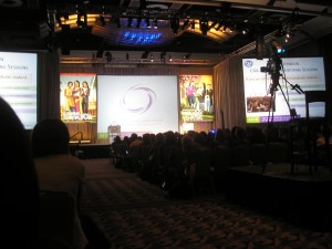
One of the keynote speakers, Duy-Loan T. Le, was a brilliant orator. She held the audience captive. She had no powerpoint, no slides, nothing but a microphone. Her speech reminded me that far too often, presentations of one's work or ideas are focused on the text and images lit up on the screen. The right way to do it: focus on you, explaining and selling your work. A display is great for diagrams and supporting pictures. It's a bonus for clarifying points. But that's all it should be: support. Not the focus.
The wrong way: what not to do & how to fix it
The general approach to presentations these days assumes that the focus is on the slides, not the person talking. Personally, I watch the speaker. I'll glance over at the screen now and then. If I can't understand the talk because I'm not reading along on the slides, there's a serious problem.
-
Never, ever read sentences directly off the slides. If you do, it means you have too much text on your slides. You can read directly from your notes. Your notes should not be posted on your slides.
-
Talk slower than you think you should. Everyone in the audience appreciates an intelligible speaker.
-
Make clean slides, both in terms of amount of content on any one slide and the content's format. This topic could fill a book; I've touched on it before. Use a font large enough for people to read from the back row. Use easy-to-read colors. Don't cram text and graphics into every empty space. If you're just going to gloss over a topic, you don't need paragraphs about it on your slides - particularly when you flip through your slides more quickly than people can read your paragraphs. What's the point of having so many words if no one is going to read them?
-
Don't have paragraphs on your slides, period. If I want the novel, I'll email you for it, thanks. A presentation involves you and it involves you, presenting. I once sat through a presentation in which the speaker used a gimmick of little cartoon fishies with whom she "conversed" and who "helped explain" her topic. The fishies even made noise - yup, she found a garbled, irritating bubbling audio track. Multiple times, she told the audience, "I'll let my fish friends explain," and proceeded to stand quietly on the side of the stage as the audio track played. We, as the audience, were expected to sit there reading the slides.
-
Proof-read your slides. At GHC, I saw the phrase "If you don't, know one else will."
-
Unless you specifically know your audience will be full of programmers, don't put huge chunks of Java pseudocode in your slides. Even if you're giving a talk for an audience that is mostly technical women, your presentation needs to understandable by the non-programmers, at least on a general level. Similarly, if you're going to include technical details, don't gloss over them using unexplained technical terminology to "give the flavor," because all the audience learns is that they don't know the jargon.
-
Insist on a mobile microphone and/or a laser pointer. Sometimes you don't have a choice, such as at GHC this year. Tied to a specific location on the stage, you're unable to gesture at your slides or point to them except in a vague, flailing manner, and unable to be heard unless you're rigidly standing in one spot. A laser pointer and and a mobile mic add flexibility and allow you to more easily incorporate your slides into your talk.


Carolyn Blogs said:
blog.carolynworks.com/?p=518
[…] some presentation tips based on her impressions at the conference. Full details can be found on her entry, but the highlights […]
Nov. 4, 2010, 12:25 p.m.